ChartTalk: Is Gold Ready to Break Out? This Level Holds the Key!

ChartTalk: Is Gold Ready to Break Out? This Level Holds the Key!

Investment demand for gold surged in 2020 due to the COVID-19 pandemic, which triggered a global recession, unprecedented monetary and fiscal stimulus measures, and heightened market volatility. According to the World Gold Council (WGC), global gold-backed exchange-traded funds (ETFs) saw record inflows of 877 tonnes in 2020, surpassing the previous record of 646 tonnes in 2009.

ChartTalk – This Is Free!!

Our FREE technical newsletter – Get actionable and profit-generating trade ideas in your mailbox.

* indicates required

Gold is one of the most sought-after commodities in the world. It has been used as a store of value, a hedge against inflation, and a safe haven asset for centuries. But can gold continue to shine in the current market scenario?

Gold has been in a strong uptrend since 2019 when it broke out of a multi-year consolidation pattern. It reached an all-time high of 2075 in August 2020, before correcting to 1765 in November. Since then, it has bounced back to test the previous high twice, forming a double-top pattern.

A double top consists of two peaks that are roughly equal in height, separated by a trough. Although a double top is considered resistance from a technical perspective; however, any consolidation near the high point indicates strength.

Gold has strong support that exist around 1900. It is currently trading between 1950-2000, which is a critical resistance zone. If gold can break above 2000 and sustain above it, it will stage a breakout and invalidate the double-top pattern and resume its uptrend. However, if gold fails to break above 2000 and falls below 1900, it will confirm the double top pattern and can stay under broad consolidation for some more time.

The monthly chart shows some positive signs for gold. The moving average convergence divergence (MACD) indicator, which measures the momentum and trend direction of an asset, has crossed above its signal line and turned bullish. This indicates that the buyers are gaining strength and could push the price higher.

From the Indian context, Gold has been trading in a narrow range for the past few weeks, as it faces strong resistance at 60000 levels. This level has been tested several times but failed to break above it convincingly. A sustained move above 60000 would signal a bullish breakout for the precious metal, opening the door for further gains towards 65000 rupees and beyond. However, if gold fails to overcome this hurdle, it may consolidate with the support that exists in the 55000-56000 zone.

Another factor to consider is the relative performance of gold against silver. Gold and silver are often correlated, as they are both precious metals that respond to similar market forces. However, sometimes they diverge, as they have different industrial and monetary uses.

The relative strength (RS) line of gold against silver shows how gold is performing relative to silver. A rising RS line means that gold outperforms silver, while a falling RS line means silver outperforms gold.

The RS line of gold against silver has been broadly rising since 2011, indicating that gold has been more favored than silver over the long term. However, in the past year, the RS line has been mostly flat, indicating that both metals have been performing similarly. This suggests that there is no clear advantage for either metal at the moment.

As of now, the price behavior of Gold in the 1950-2000 range needs to be closely watched. Any meaningful move above 2000 is likely to take the precious metal higher toward 2070-2075 levels. However, until that happens, we might well see Gold consolidating in a 1900-2000 zone.

Foram Chheda, CMT

ChartTalk: Surge in US Dollar Index: Where is the USD/INR Going?

ChartTalk: Surge in US Dollar Index: Where is the USD/INR Going?

On February 24th, 2023, the U.S. Dollar Index (DXY) experienced a surge, rising from a low of 104.42 to a high of 105.32.  This surge was largely due to the release of the Core Personal Consumption Expenditure (PCE) Price Index data from the US, which showed that inflation rose at a stronger pace than expected in January. This led to a USD rally and weighed on the Euro and other major currencies. Additionally, the Federal Reserve had been increasing interest rates in an effort to tame inflation, which further contributed to the surge in the DXY.

ChartTalk – This Is Free!!

Our FREE technical newsletter – Get actionable and profit-generating trade ideas in your mailbox.

* indicates required

A look at the US Dollar Index (DXY) Weekly Chart shows that it took out a major double-top resistance as it move above 105-50 – 106.00 levels in July last year. The surge was strong; it saw DXY testing the highs near 114.75 in September 2022. Though that rise had come with a bearish divergence of the RSI against the price, the quantum of the surge was significant; it was almost to the tune of 8.75%.

However, the retracement that followed was even larger; DXY tested the levels of 100.68 in January this year. The recent surge has seen the Dollar Index halting just below the 50-Week MA of 105.35. This makes the zone of 105.35-106 a potential resistance area for DXY.

On the Daily chart as well, the DXY saw a sharp retracement after it fell off from a declining channel that was created between September and November 2022. The recent pullback has seen DXY penetrating and breaking above the falling trend line pattern resistance; this trend line begins from 107.80 and joins the subsequent lower tops. 

However, again, going ahead, it has a resistance to face where 100-Day MA and 200-Day MA are very near to each other. They are placed at 106.17 and 106.32 respectively.

Reading these levels along with the resistance levels seen on weekly charts, the zone of 105.35 to 106.50 can be described as a strong resistance area for DXY.

This brings us to USDINR. This pair, i.e., the Indian currency has been trading at crucial levels over the past quarter.

USDINR made a high of 83.26 in October 2022; since then it has been trading in a defined range. However, the price action from November 2022 to date has resulted in the development of an ascending triangle. Nevertheless, USDINR has a strong resistance area between current levels and 83.26.

The current setup can be interpreted in two ways. On a plain reading, if the strength in the Dollar Index (DXY) persists, we have a valid case of USDINR depreciating more in form of an attempted breakout from this ascending triangle formation.

In the other reading, while keeping the above observation in context, the pair is also likely to find a strong resistance between the 82.80-83.27 range. This possibility also cannot be ruled out if the DXY halts its rally near the above-mentioned resistance zone of 105.35-106.50. The strong Relative Strength of INR against the USD has started to give up; the RS line has reversed its trend and it has slipped below the 50-Day MA.

CONCLUSION: The interpretation is pretty straightforward in the present technical setup. While respecting the levels seen on the charts, any move above 83 in the USDINR pair is likely to see the Indian currency depreciating in the near term. This may lead the pair to test 83.25 and 83.85 levels over the near term.

However, to have this reading triggered, observing the behavior of the USDINR pair against the levels of 83 will be crucial.

Foram Chheda, CMT

Chart Talk: This Small-Cap Stock Can Be Added To Your Portfolio

Chart Talk: This Small-Cap Stock Can Be Added To Your Portfolio

It certainly pays to keep things simple. While technically analyzing a stock, you don’t always need to have your chart look like a rainbow, comprising multiple colors, and with a plethora of indicators and oscillators plotted on it. Most of the time, a simple chart throws in a lot more information than something that looks too complex. It is often said, and it is true as well, that over-analysis kills!

It is a basic tenet of technical analysis that the longer the time that a pattern takes to evolve on a chart, the more reliable and potent that pattern becomes. This holds true for any technical pattern regardless of whether it is a continuation pattern or trend reversal pattern. There is some generalization involved; for example, one would see rounding tops being more distinctly found in large-cap stocks or rounding bottoms being found more commonly in smaller stocks, but most of the patterns are found across the universe.

ChartTalk – This Is Free!!

Our FREE technical newsletter – Get actionable and profit-generating trade ideas in your mailbox.

* indicates required

The interesting part is that this rectangle pattern has taken a year to develop. If we look at a higher time frame (Weekly) charts, a similar pattern appears. This makes this pattern fractal in nature. This is evidenced by the weekly chart below.

A similar rectangle pattern appears making the one that appears on the daily chart fractal in nature. Besides this, all other indicators support the attempted breakout. The OBV on both the timeframes has marked a high indicating participation of volumes in the breakout. The RS line against the broader markets remains in a strong uptrend and remains above the 50-period MA.

The stock remains in the leading quadrant of the RRG; on the weekly timeframe, it is inside the improving quadrant indicating that a phase of its relative outperformance against the broader markets has likely begun.

The week has not ended yet but in all likelihood, this breakout may remain valid and in place. If this happens, then going by the price measurement implications, the stock may go on to test 775 to 800 levels if held for at least a medium-term horizon resulting in a price appreciation of ~15% from the current levels.

Foram Chheda, CMT

ChartTalk: Expect A Major Trend Reversal In This Stock

ChartTalk: Expect A Major Trend Reversal In This Stock

The equity markets have been jittery over the past few weeks; the front-line Index NIFTY50 failed to sustain a breakout after moving past the previous lifetime high. After marking an incremental high, the index slipped below the breakout point. However, the broader markets stayed highly stock-specific; many stocks that had grossly underperformed the markets, in general, are showing signs of some structural reversal of the trend. This insurance aggregator is showing some classical signs of reversal of the downtrend and is in process of confirming its bottom in place.

ChartTalk – This Is Free!!

Our FREE technical newsletter – Get actionable and profit-generating trade ideas in your mailbox.

* indicates required

PB Fintech Ltd (POLICYBZR) has a relatively short listing history. The stock made its high on its listing day near 1470 in November 2021; it had a terrible performance since then. By November of this year, the stock had ended up losing over 76% of its value. However, following the marking of lows between 356-375 during October-November of this year, the stock has made a strong attempt to reverse its downtrend.

Strong classical signs have emerged on the charts indicating a bottom in place for this stock.

While the stock was moving sideways in the 356-375 zone, an exponential increase in volumes was seen in November. Volumes analysis would mean that any exponential increase in volume may hint at a potential bottom for the stock and may mark a point of reversal. The confirmation of this indication came from a sharp rise in the On-Balance Volume (OBV) during the same period; this confirmed that there was a strong accumulation of the stock at the lower levels.

The Relative Strength improved as well; the RS line (compared with the broad market index NIFTY500) reversed its downtrend and started inching higher eventually crossing above the 50-period MA.

While the stock was still marking incremental lower lows, the RSI had already sharted showing strong positive divergence against the price by marking higher bottoms.

If the current technical structure resolves on the expected lines, the stock may confirm a reversal of the trend; subsequently, it has the potential to test 550 levels and that would mean a price appreciation of 15% from the current levels. Any move below the 470 level would invalidate this technical setup.

Foram Chheda, CMT

ChartTalk: Expect Leadership From This Sector As It May Confirm A Reversal

ChartTalk: Expect Leadership From This Sector As It May Confirm A Reversal

Despite the ever-depreciating Rupee, this sector has been showing gross relative underperformance against the broader markets for many months. In fact, globally as well, the technology sector has taken a severe beating in this calendar year; this was evident in the YTD performance of NASDAQ which has been one of the worst-performing indexes globally.

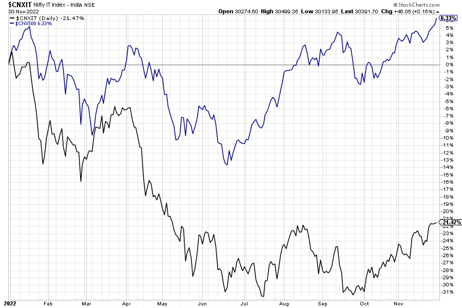
A similar trend was seen in the domestic markets as well. From the sectoral point of view, the NIFTY IT index has been one of the laggards this calendar year.

ChartTalk – This Is Free!!

Our FREE technical newsletter – Get actionable and profit-generating trade ideas in your mailbox.

* indicates required

Speaking on YTD terms, while the broader NIFTY500 index has returned a positive return of 6.33%, the NIFTY IT Index has returned a negative return of (-21.47%) on a similar timeframe.

However, some strong signs are seen appearing on the NIFTY IT Sector Index that show that it may be in a process of confirming its reversal of trend in the near term.

The NIFTY IT index topped out in early January of this year when it marked its high at 39157.75. Following a brief consolidation just below that level, it saw a sharp decline and slipped under correction. It went on to lose over 12900 points (-32.89%) from its peak until it attempted to find its support near 26450 levels in June.

What followed after that was a technical pullback, and until October of this year, NIFTY IT Index tested this level on several occasions. This led to the formation of multiple support points near 26450 levels. It was this October onward that the NIFTY IT index started to inch higher; it moved above the 50-, and the 100-DMA in the process, and presently it is seen making attempts to move past the 200-DMA which is presently at 30239,

From other pieces of technical evidence present on the chart, there is a high possibility that the IT Index will eventually break above the 200-DMA; if this happens, it would confirm an end and subsequent reversal of the downtrend that this sector witnessed over the past many months.

The current levels also mark a classical double top; any move above 200-DMA will also lead to a breakout from this formation. RSI has marked a 14-period high which is bullish. The RS line against the broader markets has reversed its trajectory and remains above the 50-period MA.

The IT Sector is inside the leading quadrant of the RRG when benchmarked against the broader NIFTY 500 Index. Also on the weekly timeframe, this sector remains buoyantly placed inside the Improving quadrant while strongly maintaining its relative momentum against the broader markets.

Going ahead from here, so long as the NIFTY IT Index keeps its head above 29000 levels, it remains well-equipped to not only relatively outperform the broader markets in event of any consolidation but also provide strong leadership in the rising markets.

Foram Chheda, CMT